


Home page


 Dave's Picks Vol. 50: Palladium, New York City, NY 5/3/77
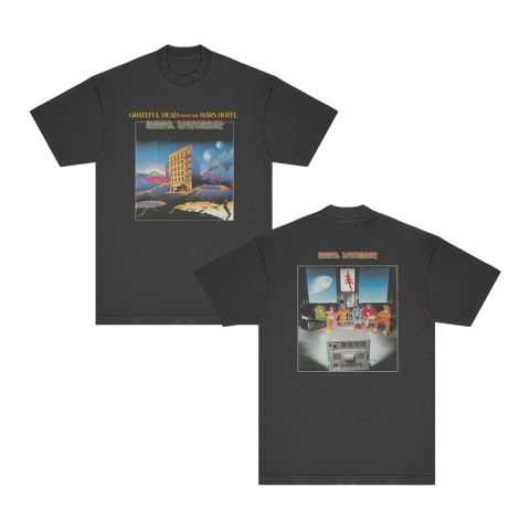
 Mars Hotel Angel's Share
 From the Mars Hotel


https://www.dead.net/video/grateful-dead-estimated-prophet-philadelphia-pa-771989-456471
Grateful Dead - Estimated Prophet (Philadelphia, PA 7/7/1989)
Taper's Section
- https://d2cstorage-a.akamaihd.net/wr/Gratefuldead/tapers_2024/apr292024/71.mp3, https://d2cstorage-a.akamaihd.net/wr/Gratefuldead/tapers_2024/apr292024/82.mp3, https://d2cstorage-a.akamaihd.net/wr/Gratefuldead/tapers_2024/apr292024/89.mp3https://www.dead.net/features/tapers-section/april-29-may-5-2024April 29 - May 5, 2024
Jam Of The Week
- https://d2cstorage-a.akamaihd.net/wr/Gratefuldead/jamoftheweek2024/8_4_89_Cal_Expo.mp3https://www.dead.net/features/jam-week/april-26-may-2-2024April 26 - May 2, 2024
GD Radio Hour
- https://d2cstorage-a.akamaihd.net/wr/Gratefuldead/gdh_2024/gdh_apr2024/gdh1848_podcast.mp3https://www.dead.net/features/gd-radio-hour/grateful-dead-hour-no-1848Grateful Dead Hour No. 1848
All The Years Live
- https://www.dead.net/all-years-liveAll The Years Live
Grateful dead community

estimated-eyes commented on the topic: Dave's Picks Vol. 50: Palladium, New York City, NY 5/3/77
5 minutes ago

billy the kiddd commented on the topic: Dave's Picks Vol. 50: Palladium, New York City, NY 5/3/77
10 hours 6 minutes ago

Cousins Of The… commented on the topic: Dave's Picks Vol. 50: Palladium, New York City, NY 5/3/77
15 hours 41 minutes ago

Dead Admin posted on the forum topic: Dave's Picks Vol. 50: Palladium, New York City, NY 5/3/77
1 week 3 days ago
Dead Admin posted on the forum topic: Robert Hunter: Tales Of The Great Rum Runners [2CD]
2 weeks 5 days ago
Dead Admin posted on the forum topic: Robert Hunter: Tales Of The Great Rum Runners (Deluxe) [2LP]
2 weeks 5 days ago
Dead Admin posted on the forum topic: Robert Hunter: Tales Of The Great Rum Runners [Digital Download]
2 weeks 5 days ago
Dead Admin posted on the forum topic: From The Mars Hotel (50th Anniversary Remaster) Dead.Net Exclusive [1LP]
1 month ago
Dead Admin posted on the forum topic: From The Mars Hotel (50th Anniversary Deluxe Edition) [3CD]
1 month ago
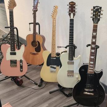
Grateful Gear


https://www.dead.net/deadcast/mars-hotel-50-unbroken-chain
From the Mars Hotel 50: Unbroken Chain
dead comment
Joe Bonamassa tickets
Joe Bonamassa is an acclaimed nation vocalist, so don't miss the likelihood to visit [url=http://joebonamassatour.com/]Joe Bonamassa concerts[/url]
gsn casino games xqxxe
free vegas casino games <a href="https://casinorealmoney.icu/">best online casino</a> | <a href=" https://casinorealmoney.icu/ ">foxwoods online casino</a> | [url=https://casinorealmoney.icu/]free casino games slotomania[/url] [url=https://casinorealmoney.icu/]casino slots[/url]
KISS Concerts
Interested in hardrock? How about KISS? The band is on a tour right now all across USA and Canada. Visit [url=http://kisstourdates.com]KISS Tour Dates Minneapolis[/url] to know more about KISS tour in 2019.
admin contact please
I think the site needs updating. Can you please contact the admin?
dfghtekbmkm
http://5.200.52.19/forum/index.php?PAGE_NAME=profile_view&UID=143334
http://sch5.spb.ru/forum/user/1531/
http://www.spelin.ru/forum/index.php?PAGE_NAME=profile_view&UID=13614
http://atombroker.ru/forum/user/17338/
http://rab.innova-school.ru/forum/user/93252/
аммиачная селитра удобрение
Добрый день друзья!
[url=https://agro-himiya.by/][img]https://img10.lostpic.net/2016/10/02/a9dce…]
Минеральные удобрения– вещества, имеющие неорганическую природу происхождения. Они традиционно используются в сельском хозяйстве, так как являются более доступными, чем органические, дают быстрый положительный эффект, и имеют широкий спектр действия. Также их гораздо удобнее и дешевле транспортировать.
1)[url=https://agro-himiya.by]аммиачная селитра купить в минске [/url] - Минеральные удобрения купить в Минске можно самовывозом в течении 20 минут, либо c оперативной доставкой.Покупая у нас, вы можете заказать товар, как оптом, так и в розницу. Крупным заказчикам всегда предоставляются скидки в объеме соответствующей величине сделки между нами.
2)[url=https://agro-himiya.by]минеральные удобрения купить Минск[/url] - Мы предлагаем вам приобрести только комплексные препараты, позволяющие полностью насытить потребности растения после обработки. Наши поставщики имеют в штате квалифицированных специалистов, способных точно произвести расчёты и анализ почвы, а на основе этих показателей создать для вас удобрения с идеальным набором макро- и микроэлементов.
3)[url=https://agro-himiya.by]неорганические удобрения купить[/url] - Каждый товар проходит тщательные клинические испытания на различных видах почв и только после этого запускается в серийное производство. Вы можете использовать нашу продукцию не только в целях крупной агрокорпорации с тысячами гектаров земли, но и для облагораживания приусадебного участка, дачных посевов.
4)[url=https://agro-himiya.by]минеральные удобрения в Беларуси[/url] - Мы заботимся о том, чтобы предоставляемый нами сервис был высокого уровня. В этом нам помогает наличие главного офиса, складов для готовой продукции, сети дилеров. Кроме того, мы дорожим своей репутацией и несем ответственность за качество нашего товара.
Мы будем рады Вас видеть у нас на сайте [url=https://agro-himiya.by]НАЖМИТЕ ССЫЛКУ[/url]
Увидимся!
[url=http://agro-himiya.by/]правила хранения минеральных удобрений[/url]
[url=http://agro-himiya.by/]жидкие комплексные удобрения почвы[/url]
[url=http://agro-himiya.by/]удобрения для рассады[/url]
[url=http://agro-himiya.by/]удобрение осенью под деревья[/url]
[url=http://agro-himiya.by/]группа удобрений[/url]
[url=http://agro-himiya.by/]комплексные удобрения цена[/url]
[url=http://agro-himiya.by/]удобрение весеннее[/url]
[url=http://agro-himiya.by/]луварам гербицид[/url]
[url=http://agro-himiya.by/]фосфорные удобрения[/url]
[url=http://agro-himiya.by/]жидкие комплексные мин удобрения[/url]
[url=http://agro-himiya.by/]стимулятор роста для растений купить[/url]
[url=http://agro-himiya.by/]удобрения семян рассады[/url]
[url=http://agro-himiya.by/]купить комплексные удобрения[/url]
[url=http://agro-himiya.by/]агрохимия[/url]
[url=http://agro-himiya.by/]гербицид торнадо купить[/url]
[url=http://agro-himiya.by/]удобрение аммиачной водой[/url]
[url=http://agro-himiya.by/]белорусские удобрения[/url]
[url=http://agro-himiya.by/]важнейшие азотные удобрения[/url]
[url=http://agro-himiya.by/]жидкое удобрение для орхидей[/url]
[url=http://agro-himiya.by/]минеральное удобрение озимой пшеницы[/url]
[url=http://agro-himiya.by/]карбамид аммофос[/url]
[url=http://agro-himiya.by/]лучше вносить удобрения[/url]
[url=http://agro-himiya.by/]аммофос действующее вещество[/url]
[url=http://agro-himiya.by/]жидкое комплексное удобрение для фиалок[/url]
[url=http://agro-himiya.by/]жидкие комплексные удобрения для томатов[/url]
[url=http://agro-himiya.by/]жидкие удобрения для хвойных растений[/url]
[url=http://agro-himiya.by/]удобрение для пионов[/url]
[url=http://agro-himiya.by/]удобрения подкормка клубники[/url]
[url=http://agro-himiya.by/]агрохимия и система удобрений[/url]
[url=http://agro-himiya.by/]внесение минеральных удобрений подкормки[/url]
[url=http://agro-himiya.by/]нормы внесения удобрений[/url]
[url=http://agro-himiya.by/]чем заменить кальциевую селитру[/url]
[url=http://agro-himiya.by/]производители удобрений[/url]
[url=http://agro-himiya.by/]основные виды удобрений[/url]
[url=http://agro-himiya.by/]где купить аммиачную селитру в минске[/url]
[url=http://agro-himiya.by/]технология производства удобрений[/url]
[url=http://agro-himiya.by/]купить аммофос цена[/url]
[url=http://agro-himiya.by/]фосфорно калийные удобрения[/url]
[url=http://agro-himiya.by/]сернокислый магний удобрение применение[/url]
[url=http://agro-himiya.by/]жидкое удобрение гумат калия[/url]
[url=http://agro-himiya.by/]удобрение почвы селитрой[/url]
[url=http://agro-himiya.by/]нутривант плюс малина[/url]
[url=http://agro-himiya.by/]удобрение для орхидей бона форте купить[/url]
[url=http://agro-himiya.by/]перечень удобрений[/url]
[url=http://agro-himiya.by/]растворимые удобрения[/url]
[url=http://agro-himiya.by/]удобрения подкормки орхидей[/url]
[url=http://agro-himiya.by/]классификация минеральных удобрений[/url]
[url=http://agro-himiya.by/]посевы[/url]
[url=http://agro-himiya.by/]магний удобрение применение[/url]
[url=http://agro-himiya.by/]минеральные удобрения цветов домашних[/url]
комплексные минеральные удобрения
Доброго времени суток господа!
[url=https://agro-himiya.by/][img]https://img10.lostpic.net/2016/10/02/a9dce…]
Минеральные удобрения– вещества, имеющие неорганическую природу происхождения. Они традиционно используются в сельском хозяйстве, так как являются более доступными, чем органические, дают быстрый положительный эффект, и имеют широкий спектр действия. Также их гораздо удобнее и дешевле транспортировать.
1)[url=https://agro-himiya.by]аммиачная селитра купить в минске [/url] - Минеральные удобрения купить в Минске можно самовывозом в течении 20 минут, либо c оперативной доставкой.Покупая у нас, вы можете заказать товар, как оптом, так и в розницу. Крупным заказчикам всегда предоставляются скидки в объеме соответствующей величине сделки между нами.
2)[url=https://agro-himiya.by]минеральные удобрения купить Минск[/url] - Мы предлагаем вам приобрести только комплексные препараты, позволяющие полностью насытить потребности растения после обработки. Наши поставщики имеют в штате квалифицированных специалистов, способных точно произвести расчёты и анализ почвы, а на основе этих показателей создать для вас удобрения с идеальным набором макро- и микроэлементов.
3)[url=https://agro-himiya.by]неорганические удобрения купить[/url] - Каждый товар проходит тщательные клинические испытания на различных видах почв и только после этого запускается в серийное производство. Вы можете использовать нашу продукцию не только в целях крупной агрокорпорации с тысячами гектаров земли, но и для облагораживания приусадебного участка, дачных посевов.
4)[url=https://agro-himiya.by]минеральные удобрения в Беларуси[/url] - Мы заботимся о том, чтобы предоставляемый нами сервис был высокого уровня. В этом нам помогает наличие главного офиса, складов для готовой продукции, сети дилеров. Кроме того, мы дорожим своей репутацией и несем ответственность за качество нашего товара.
Мы будем рады Вас видеть у нас на интернет ресурсе [url=https://agro-himiya.by]НАЖМИТЕ ССЫЛКУ[/url]
Увидимся!
[url=http://agro-himiya.by/]нутривант плюс купить в интернет магазине[/url]
[url=http://agro-himiya.by/]норма удобрений[/url]
[url=http://agro-himiya.by/]теплота растворения аммиачной селитры[/url]
[url=http://agro-himiya.by/]производство комплексных удобрений[/url]
[url=http://agro-himiya.by/]цена протравитель тебу 60[/url]
[url=http://agro-himiya.by/]простой суперфосфат удобрение[/url]
[url=http://agro-himiya.by/]гранулирование удобрений[/url]
[url=http://agro-himiya.by/]известковые удобрения[/url]
[url=http://agro-himiya.by/]кристалон цветов[/url]
[url=http://agro-himiya.by/]перевозка минеральных удобрений[/url]
[url=http://agro-himiya.by/]сроки удобрения[/url]
[url=http://agro-himiya.by/]удобрение роста цветов[/url]
[url=http://agro-himiya.by/]фосфорные удобрения суперфосфат[/url]
[url=http://agro-himiya.by/]технология применения удобрений[/url]
[url=http://agro-himiya.by/]удобрение плодородие[/url]
[url=http://agro-himiya.by/]удобрения для корнеплодов[/url]
[url=http://agro-himiya.by/]диаммофоска это[/url]
[url=http://agro-himiya.by/]нужны минеральные удобрения растениям[/url]
[url=http://agro-himiya.by/]удобрения для рассады[/url]
[url=http://agro-himiya.by/]сколько стоит нитрат калия[/url]
[url=http://agro-himiya.by/]комплексы удобрений[/url]
[url=http://agro-himiya.by/]удобрение сапропель применение[/url]
[url=http://agro-himiya.by/]диаммофоска купить 50 кг[/url]
[url=http://agro-himiya.by/]аммофос аммофоска[/url]
[url=http://agro-himiya.by/]гербициды вьюнка[/url]
[url=http://agro-himiya.by/]удобрение с железом[/url]
[url=http://agro-himiya.by/]система применения минеральных удобрений[/url]
[url=http://agro-himiya.by/]минеральные удобрения фосфорные и калийные[/url]
[url=http://agro-himiya.by/]зеленое удобрение[/url]
[url=http://agro-himiya.by/]кальциевая селитра кальцинит 1 кг минск купить[/url]
[url=http://agro-himiya.by/]искусственные удобрения[/url]
[url=http://agro-himiya.by/]удобрения самомес[/url]
[url=http://agro-himiya.by/]минеральные удобрения внешний вид[/url]
[url=http://agro-himiya.by/]нейтрализация аммиачной селитры[/url]
[url=http://agro-himiya.by/]удобрения огородных культур[/url]
[url=http://agro-himiya.by/]анализ жидких комплексных удобрений[/url]
[url=http://agro-himiya.by/]атланте лобос[/url]
[url=http://agro-himiya.by/]внесение жидких минеральных удобрений[/url]
[url=http://agro-himiya.by/]какие минеральные удобрения клубники[/url]
[url=http://agro-himiya.by/]срок годности минеральных удобрений[/url]
[url=http://agro-himiya.by/]минеральные удобрения малины[/url]
[url=http://agro-himiya.by/]купорос удобрение[/url]
[url=http://agro-himiya.by/]сухие минеральные удобрения[/url]
[url=http://agro-himiya.by/]удобрение фруктовых деревьев осенью[/url]
[url=http://agro-himiya.by/]жидкие комплексные удобрения для картофеля[/url]
[url=http://agro-himiya.by/]атлант плюс цена[/url]
[url=http://agro-himiya.by/]жидкие комплексные удобрения для огурцов[/url]
[url=http://agro-himiya.by/]удобрение в гранулах[/url]
[url=http://agro-himiya.by/]где купить удобрения[/url]
[url=http://agro-himiya.by/]сколько вносить удобрения[/url]
сроки и способы внесения удобрений
Приветствую Вас друзья!
[url=https://agro-himiya.by/][img]https://img10.lostpic.net/2016/10/02/a9dce…]
Минеральные удобрения– вещества, имеющие неорганическую природу происхождения. Они традиционно используются в сельском хозяйстве, так как являются более доступными, чем органические, дают быстрый положительный эффект, и имеют широкий спектр действия. Также их гораздо удобнее и дешевле транспортировать.
1)[url=https://agro-himiya.by]аммиачная селитра купить в минске [/url] - Минеральные удобрения купить в Минске можно самовывозом в течении 20 минут, либо c оперативной доставкой.Покупая у нас, вы можете заказать товар, как оптом, так и в розницу. Крупным заказчикам всегда предоставляются скидки в объеме соответствующей величине сделки между нами.
2)[url=https://agro-himiya.by]минеральные удобрения купить Минск[/url] - Мы предлагаем вам приобрести только комплексные препараты, позволяющие полностью насытить потребности растения после обработки. Наши поставщики имеют в штате квалифицированных специалистов, способных точно произвести расчёты и анализ почвы, а на основе этих показателей создать для вас удобрения с идеальным набором макро- и микроэлементов.
3)[url=https://agro-himiya.by]неорганические удобрения купить[/url] - Каждый товар проходит тщательные клинические испытания на различных видах почв и только после этого запускается в серийное производство. Вы можете использовать нашу продукцию не только в целях крупной агрокорпорации с тысячами гектаров земли, но и для облагораживания приусадебного участка, дачных посевов.
4)[url=https://agro-himiya.by]минеральные удобрения в Беларуси[/url] - Мы заботимся о том, чтобы предоставляемый нами сервис был высокого уровня. В этом нам помогает наличие главного офиса, складов для готовой продукции, сети дилеров. Кроме того, мы дорожим своей репутацией и несем ответственность за качество нашего товара.
Мы будем рады Вас видеть у нас на вебресурсе [url=https://agro-himiya.by]НАЖМИТЕ ССЫЛКУ[/url]
От всей души Вам всех благ!
[url=http://agro-himiya.by/]типы удобрений[/url]
[url=http://agro-himiya.by/]расчет удобрений[/url]
[url=http://agro-himiya.by/]жидкое комплексное удобрение для хвойных[/url]
[url=http://agro-himiya.by/]фаско удобрения[/url]
[url=http://agro-himiya.by/]типы минеральных удобрений[/url]
[url=http://agro-himiya.by/]удобрения для туи[/url]
[url=http://agro-himiya.by/]внесение минеральных удобрений агротехнические требования[/url]
[url=http://agro-himiya.by/]удобрение азот[/url]
[url=http://agro-himiya.by/]райкат старт[/url]
[url=http://agro-himiya.by/]аммиачная селитра[/url]
[url=http://agro-himiya.by/]гербициды вьюнка[/url]
[url=http://agro-himiya.by/]удобрения минеральные кальций[/url]
[url=http://agro-himiya.by/]селитра аммиачная марка а[/url]
[url=http://agro-himiya.by/]минеральные удобрения беларусь[/url]
[url=http://agro-himiya.by/]удобрение жидкий азот[/url]
[url=http://agro-himiya.by/]калийные удобрения их применение[/url]
[url=http://agro-himiya.by/]цена протравитель тебу 60[/url]
[url=http://agro-himiya.by/]удобрения при перекопке осенью[/url]
[url=http://agro-himiya.by/]удобрение грунта осенью[/url]
[url=http://agro-himiya.by/]фосфорные удобрения беларуси[/url]
[url=http://agro-himiya.by/]как сделать нитрат калия[/url]
[url=http://agro-himiya.by/]жидкие азотные удобрения кас[/url]
[url=http://agro-himiya.by/]минеральные органические удобрения растений[/url]
[url=http://agro-himiya.by/]удобрение npk для малины[/url]
[url=http://agro-himiya.by/]калиевая селитра другое название[/url]
[url=http://agro-himiya.by/]удобрение палочки[/url]
[url=http://agro-himiya.by/]рекомендации по минеральным удобрениям[/url]
[url=http://agro-himiya.by/]удобрение йод[/url]
[url=http://agro-himiya.by/]кальциевая селитра для цветов применение[/url]
[url=http://agro-himiya.by/]удобрение цена аммофос[/url]
[url=http://agro-himiya.by/]калийные удобрения фото[/url]
[url=http://agro-himiya.by/]суперфосфат аммиачная селитра[/url]
[url=http://agro-himiya.by/]минеральные удобрения определение[/url]
[url=http://agro-himiya.by/]удобрение роста клубники[/url]
[url=http://agro-himiya.by/]удобрения для роз осенью[/url]
[url=http://agro-himiya.by/]виды жидких удобрений[/url]
[url=http://agro-himiya.by/]комплексные удобрения для сада[/url]
[url=http://agro-himiya.by/]жидкие комплексные удобрения купить[/url]
[url=http://agro-himiya.by/]жидкие комплексные удобрения продажа[/url]
[url=http://agro-himiya.by/]удобрения растений осенью[/url]
[url=http://agro-himiya.by/]фосфорные удобрения виды[/url]
[url=http://agro-himiya.by/]преимущества минеральных удобрений[/url]
[url=http://agro-himiya.by/]нитрат калия купить[/url]
[url=http://agro-himiya.by/]какие бывают удобрения[/url]
[url=http://agro-himiya.by/]удобрение диаммофоска[/url]
[url=http://agro-himiya.by/]калийные удобрения это какие[/url]
[url=http://agro-himiya.by/]аммиачная селитра где[/url]
[url=http://agro-himiya.by/]удобрения вносят осенью[/url]
[url=http://agro-himiya.by/]удобрение богатый жидкое[/url]
[url=http://agro-himiya.by/]аммофос состав удобрения[/url]