


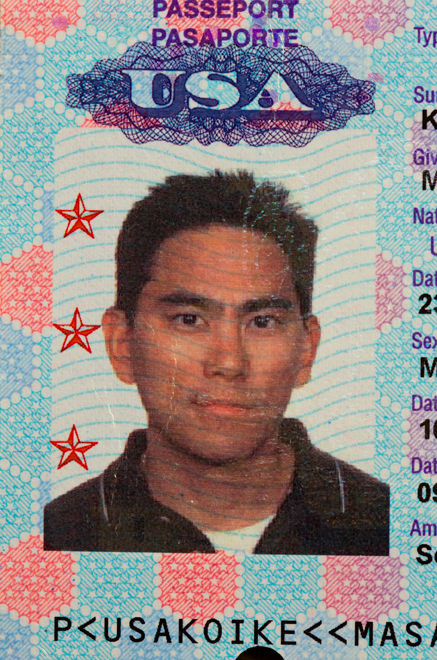


Graphic designer Masaki Koike pulls out all the stops to make beautiful boxed sets. He's even got a Grammy to prove it! Get to know the award-winning artist who's seamlessly blended the Grateful Dead's classic iconography with contemporary finishings to bring you what is truly a work of, well, art.
Let’s start by taking a look at your history as an artist...when you got started, how you got started, and your influences.
I think what got me started was my apathy for school. I would sit there and pretend like I’m taking notes but doodle instead. I’m sure this is the onset for a lot of artists. Drawing was the one thing that would elicit a response. At that age, it’s all about acceptance. This is all in hindsight, of course. When I drew Darth Vader, my peers responded which was great but I wasn’t paying attention in science class [laughs]!
I also grew up in the Hip Hop era - the music, the culture, and the graffiti. I used to love gazing at it. That was a huge inspiration for me as a kid, especially growing up in Glassell Park. Whether you liked it or not, graffiti was ubiquitous.
Did you go on to study art?
I think my parents realized that it was the thing that interested me the most - not sports or school. They sent me to Barnsdall Park in Hollywood when I was a kid. I really loved it up there. The photography class in particular was magical. This is back when you would actually develop and print your photos in the darkroom. This was the earliest training I suppose.
There was a lull between junior high to maybe the first year of college where I felt like I had to take things more seriously. So I declared my major in psychology. In the environment I was in, art was perceived more like a hobby so it wasn’t encouraged as a career. I was misguided [laughs]!
A significant moment was a typography class I took at a junior college as an elective. It really sparked an interest and I found myself putting in more hours there than any other class. It took a few years for me to make the switch to the other side of campus to the Art Department. Why fight it!
What was your first job in the graphic design business?
I wanted to design movie posters and I dove into it naively, not knowing the politics and how much legality dictated the design of movie posters. I did an internship at a movie poster powerhouse called CBO. I was there for about six months and though I learned a lot, I was completely jaded by the whole experience.
I ended up working at a small entertainment design office called Command A Studios. It was a great environment for me. Their art director just left and I coincidentally called that same day looking for a job. After we set up a meeting, they offered me the gig. They threw me right in the fire. I didn’t know what I was doing but my boss, Brian, patiently helped me through it.
How did you make the transition into music and packaging?
Music packaging was something I always wanted to do. Fortunately, A&M Records was one of the clients at Command A.
You won a Grammy for designing Rhino’s What It Is box? That must have been pretty surreal.
It was! Nobody expected much from that little box. The greatest part of that project was the small team I got to work with. It was primarily Mason Williams, Matt Abels and me. They had been working on it for years and been trying to get the boxset produced. We had a lot of creative freedom and they put together such a great compilation, it really inspired me to do my best and do the box justice. I would’ve never imagined garnering such an award for it!
Let’s get into your connection with Dead.
I certainly knew some of their popular songs growing up but the name of the band and the artwork was always memorable. It has such a definitive presence.
What about the Dead’s art? As someone who is artistic, how did that appeal to you?
And you could never use that skull anywhere else. Other skulls you could transpose for numerous brands.
Yes, it’s timeless and the perfect symbol of the Dead. So bad ass! A powerful force to be reckoned with!
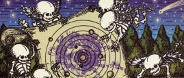
Well, we think what you did with skull on the May 1977 box, takes it to the next level. I don’t think I’ve ever seen it mirrored.
It’s twice as powerful now and there’s no escaping it!
How did you come to fully realize the concept for this boxed set?
As with any project, I began with a ton of research. Listening to their albums, reading articles, looking at the photos, existing artwork, etc. I soon realized that you could play the music and hours go by and they’ve only played 5 songs! It’s the perpetual nature of their music that puts you in a trance. It’s hypnotic, transcending and it’s mystical. Having this experience is what clicked for me. I just needed to figure out the visuals.
It was more an intuition or mood rather than a analytical solution or concept. Aesthetically, I wanted the imagery to have no specific reference to a time period and keep it current within the realms of the Dead’s brand. After all, the music is timeless and the art should speak to the generations to come.
That’s the way I look at this box, the lines, the imagery, the photographs. It’s almost, much like the music, with no beginning and no end.
Great to hear you say that! I guess I’ve done my job!!!