


![]()
Zap and Furry Freak Brothers underground comix, Victorian gardens, skateboarding, and traditional letterforms, British artist Liane Plant pulls vibes from all the decades, nay centuries, in all that she creates. For our St. Louis series, she dug deep into the Dead's 70s ebb and flow, the history of the venues they played, and of course, The Lou itself.
Let's start with your history as an artist, the when and how of your start.
I was born in Birmingham UK in 1992, a pretty grey industrial city of the West Midlands.
As a kid I was always drawing and making things, 3D pop up cards, t-shirts with blow pens and I’d also draw my own narrative for Teletubbies episodes etc.. Maybe this was my gateway to fanzines and airbrushing! that DIY element and freedom for making things was defiantly engrained in me from a young age, I’m very lucky that I was always encouraged to keep at it, & never lost the passion for it as I grew older!
Did you go on to study art professionally?
i was always really terrible with anything academic, it’s just not my thing at all. Gravitating towards music / art was just the natural route, I never tried to force myself to pursue anything that didn’t excite me so it wasn’t really a question when I left high school. I studied Art & design at Stourbridge college for three years where everything was very experimental, we’d dip our toes into every creative field with so much freedom to make art full time everyday with no outside pressure. I think this time was really important for finding my feet as a creative especially with my style and influences. I started to get really into underground comix at this time, discovering Zap and Furry Freak brothers. It was also the first time I’d discovered Ken Kesey’s acid tests with Grateful dead following suit. This opened the doors to the Dead phenomenon and psychedelic poster artists which blew my socks off. Especially the entwined typography and garish colour palettes.
After these three years at college I made the move from Birmingham to London to study graphic design/ illustration at Central St Martins. I did most of my learning outside of class, interning at print and design studios, and soaking up as much as I could from the city and artists around me.
What influenced you then, what influences you now?
I've always had a core set of influences that have just continued branching out over the years, I love ornamental art and architects like Pugin & victorian draughtsman such as John Moyr Smith. Letterforms of Traditional show cards and sign painting, Oz magazine, Kustom Kulture especially airbrushed t-shirts from Big Daddy Roth and Stanley Mouse among loads of other things.
After spending so much time at home this year Ive started to look to my surroundings for inspiration, especially nature that is so close to my home. I’m lucky to live near a really beautiful nature reserve and victorian gardens where I spent a lot of time exploring this year. The flowers and victorian ornate gravestones defiantly sparked some creativity which I channeled into the St. Louis artwork.
Let's get into your connection to skateboarding and the world of street art and skeletons! Skeletons, certainly the gateway to the Grateful Dead's iconography…
I started skateboarding when I was in high school which opened the door to a whole world or artistic expression that I’d never seen before, I remember seeing one of Jim Phillips artworks in a skate mag when I was 15 that really struck me, I’d never seen anything like it before. This definitely led me to exploring the extensive history of 80s board graphics which stuck with me completely.
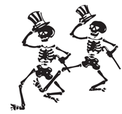
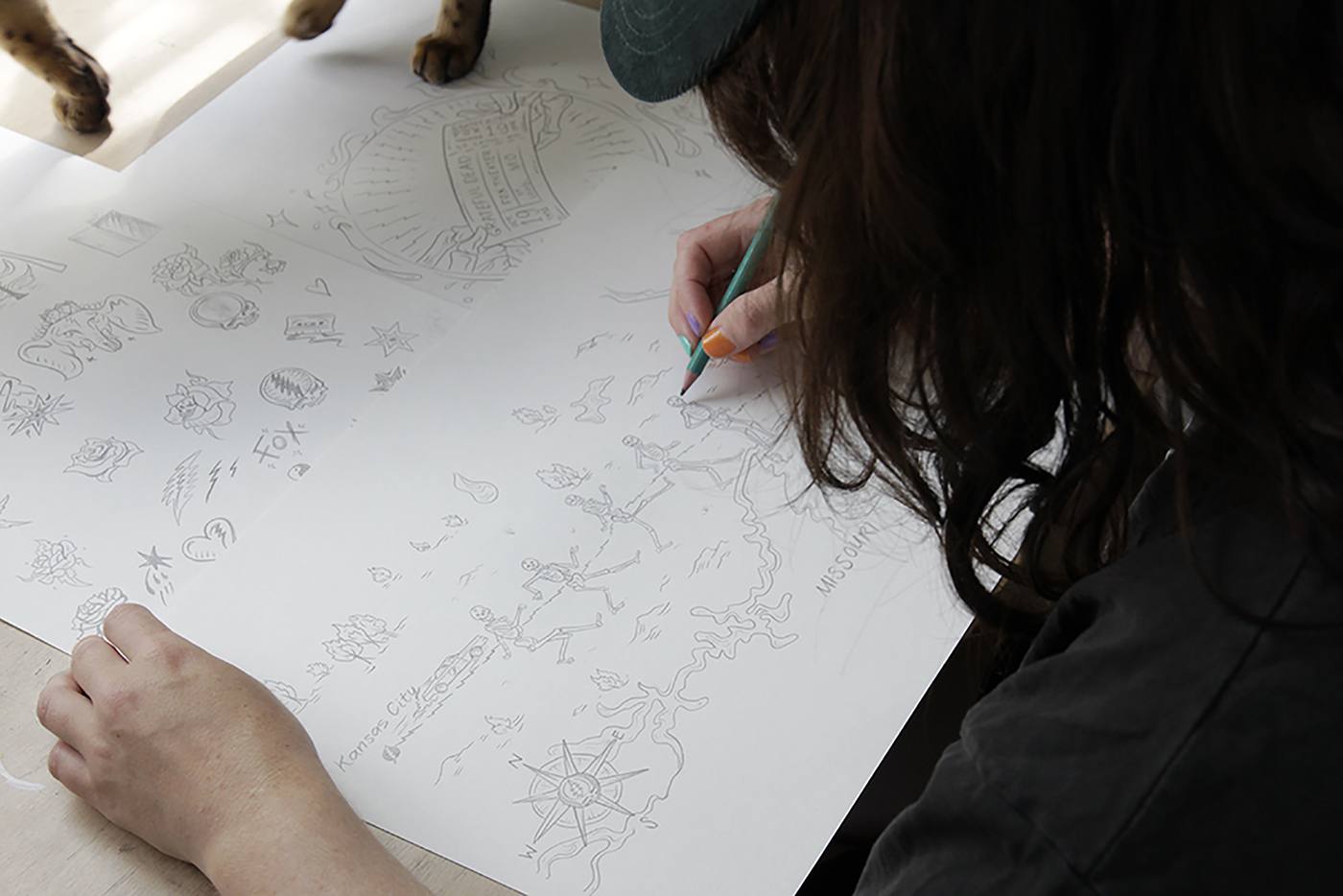
During university I started a little side hustle called Valkyrie Skates, I used to hand carve and screen print cruiser skateboards whilst I was interning at the print shop during twilight hours and sell them to my friends and through pop ups. I channeled the bright layered fluros & ‘shock’ imagery of skeletons that were prominent during that golden era of skateboarding. Everything about 80s board graphics I adore, I’m very lucky that people could see these influences in the work I started creating and trusted in me to design their board graphics, which is still nuts to me! The skeletons have been going strong since these Valkyrie days, and they’re still one of my favourite things to draw especially for Grateful Dead!!
You've been an extended member of our Grateful Dead family for quite some time now, contributing designs to our Halloween collection, Get Out The Vote campaign, and American Beauty’s 50th anniversary. How did it feel to get the call for the St. Louis series?
That first halloween collection was such a mad one! and it really was such an incredible project to be a part of! I’d spent many years listening to the Dead, and never could have dreamed of working with such an iconic band! I love the community involved with all the Grateful Dead projects, Its so much more than working up a graphic for a T-shirt or a poster, each project is putting a spin on a piece of history which I feel is very important as we all have our own personal connections to the Dead, with our own stories to tell.
The American Beauty 50th anniversary seemed like the epitome of dream jobs. Designing a poster for one of my favourite Dead records after 50 years, with all the forefather’s of poster art that were producing art at the time of the original release. I didn’t think anything this incredible would ever come around again.
Then I got the call for the St. Louis series and I couldn’t believe it. I still can’t believe it, I see the photos of the records being printed up and etching samples coming through and it still doesn’t feel real! I’m really proud of the work we created as a team and I can’t wait to see and listen to the final boxset in full glory.
Part of the beauty of the Dead's art is its malleability. What elements did you want to retain and what did you want to meld into something fresh for the series?
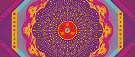
With the St. Louis boxed set we wanted to express the growth and transitions that the band went through from the 7 shows that took place in ’71 ’72 ’73.
The changes in this time were always anchored by the City of St. Louis, The flowing rivers of the St. Louis flag were broken down on the outer slip case, surrounded by flowing rose vines containing illustrated vignettes representing each transition and growth throughout these years; The loss of Pigpen in 1973, a crow representing change and ‘Wake of the flood’ which was played heavily during the last nights of the 73’ shows. A steamer trunk time capsule collecting memories and memorabilia, truck driving in to each town, the miracle ticket exchange, hitchhiking to shows and camping out etc.
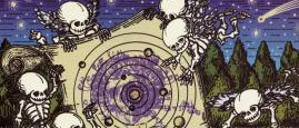
The second breakout ‘Fox Theatre, St. Louis, MO 12-10-71’ artwork combined the 1920s opulent interiors of the former movie theatre designed by C. Howard Crane. The Fox Theatre’s Asian ornamental motifs and painted interiors were incredibly beautiful, this informed the Box inner artwork as well, I based the framework shape from the box set inner sleeve from a pattern from the wall tiles in the theatre. The scene reports we were working with to inform the design from this time spoke of mirrorball’s shifting the theatre into another dimension, along with bright decibel meters glowing everywhere which can both be found within the artwork. The centre framework is based off the reels inside a cassette tape illustrated with dancing skelly deadheads traveling from show to show. The transitions of the smaller crowds gaining traction during this period, growing from the introduction of the network of underground tapes and FM broadcasts, bringing the shows across the states, direct to the homes of those who couldn’t get tickets.
We also had such a treasure trove of images and stories to work with especially for the book artwork, Bill Webber’s essay was particularly moving, I drew up an illustrated map of his physical and personal journey from Kansas to St. Louis. The essay was a personal account of the St. Louis shows, we decided to stick to everything being very loose doodles and sketches rather than refined detailed illustrations like the rest of the artwork. The account of the miracle ticket from Bear made it out as a breakout cover for ‘Light into Ashes’.
How does your creative process differ when you are designing for a boxed set vs a print or apparel?
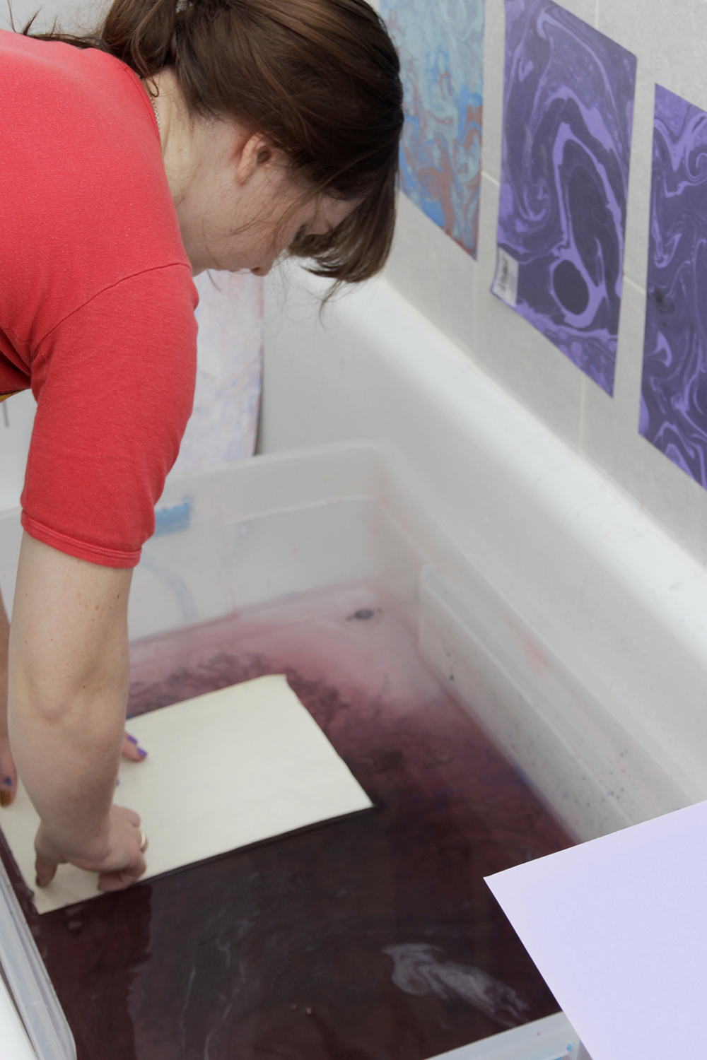
This design process was completely new to me as I’ve never made anything of this calibre, which was equally daunting and exciting! Been given this opportunity I knew I wanted to put my absolute all into it as I had with each Dead project before, I like to step back from the computer and give some element of craft within these Dead projects, whether its airbrushing the colours or marbling the background papers, its good to mix up techniques and just experiment a bit as part of the process while getting your hands dirty.
The most incredible thing about working on the St. Louis series was that we had a lot of time for the ideas to evolve naturally, with merch it is often a lot quicker for concepts and execution so it felt nice to slow it down a bit.
Working with Rory Wilson on art direction was awesome because we would just bounce ideas back and forth as well as sketches. There were so many sketches collected over the duration of the project that ended up working their way into different things down the line such as merch etc, it really took a life of its own.
What's on tap for the rest of the year?
I think slowing it down a bit and taking some time to work on some personal projects. I’ve recently started learning pattern cutting to make garments, I’m just really loving switching up my process, learning something new and seeing where it takes me!
LIANE PLANT'S GRATEFUL DEAD
First Exposure To The Dead:
Ken Kesey and the Merry Pranksters, The first Dead record I heard was Workingman’s dead.. Wow
Favorite Dead Song/Songs:
I’d probably say ‘Ripple’ is the one that holds a special place for me,
I've had some motions come out of a heavy spot and that song just completely brings me back to being re-centred.
Favorite Dead Era/Years:
71 - 73
Desert Island Dead:
Paramount Theatre 07.26.72, American Beauty
Being A Dead Head Means: Nature, nurture & not sticking to the obvious path.
FOLLOW LIANE ON INSTAGRAM. CHECK OUT HER OFFICIAL SITE.